Arcadia Billing Statement Refresh
Background
Overview
This year the billing squad led a cross-functional, strategic project to refresh Arcadia customers’ billing statements. This refresh sought to update our Arcadia statements to provide more transparency, clearly point out Arcadia’s impact on their utility bill, and allow customers to view their bill data in a digestible way. Furthermore, we designed an MV dashboard experience to provide further detail and support for our more skeptical users.
Problem

Statement comprehension was a problem for our customers. Our member experience team received over 6,500 support calls on a monthly basis last year of which 30% each month were related to billing comprehension and confusion such as:
Explanation of charges
Bill experience explanation
Confusion around Community Solar
Our Users
Residential Arcadia customers
These users:
are skeptical, anxious, and money conscious
want quick and easy ways to understand their energy bill
want to see the Arcadia’s value proposition front and center (Are they saving money with us?)
Goals
Increase statement comprehension
Increase Community Solar Comprehension
Reduce customer confusion attrition
Provide accurate & useful information to all users
My Role
Design
Research
Workshop design / lead
Collaborators
Product Manager + Eng squad
Operations
Member experience
Discovery
Adriana and I wanted to understand how the existing onboarding experience, specific screens, and language that contributed to users lack of comprehension and lack of conversion. During this discovery phase, we had a few goals:
Get a more discrete understanding of the problem(s) caused by messaging in the funnel
Identify easy opportunities for improvements through consensus across various stakeholders
Identify larger themes or projects to investigate in future phases of improvements
Mapping our current sign up flows
First, Adriana and I set out to audit our current sign up flows. If we hoped to create strategic alignment around future initiatives and improvements, we needed to be able to visualize the specific nuances and inconsistencies of each funnel.
Here is a bird’s eye view of audit.
From there, we narrowed down the scope to a residential user who is paying for community solar through Arcadia. Here is what their experience looked like (prior to updates)
Stakeholder Workshops
Next, I helped Adriana facilitate workshops with internal stakeholders from marketing, sales, customer support, analytics, product, copywriting, design, and engineering. In these workshops, we shared the conversion rates across various touchpoints in the funnel, showed visuals for each screen (thanks to our community solar map), and asked each team member to share painpoints and opportunities for each screen.
Outcomes & Analysis
After, my squad met to understand the technical constraints of the opportunities that came out of the workshop. We decided to divide these opportunities into multiple phases because
we wanted to design and develop in an iterative manner learning from quant and qual data
we weren’t sure what ideas would resonate with our users
we wanted to reduce engineering effort up front until we had more data to work with
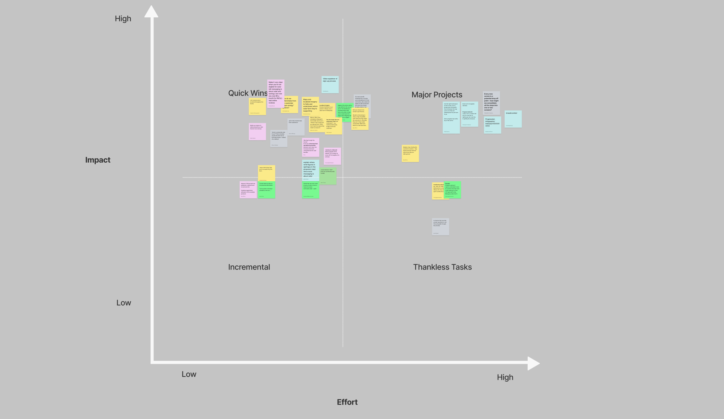
We developed an Impact Effort Matrix and focused on low effort high impact ideas. This is why our first phase included improvements to verbal and visual messaging to reduce confusion and increase conversion. These plans were slotted for a 3 months development cycle.
Opportunities of Focus
The opportunities of focus included:
highlighting benefits to encourage sign up
educating our users in contextual moments to mitigate drop off
building trust through transparency and clarity

Design
Content and Information Hierarchy
It was time for me to start designing! My first step was to audit the specific screens within the sign up flow and improve the information hierarchy. It was most important be upfront with the user about their eligibility. Our research showed users were more likely to drop off if they were unable to comprehend their eligibility upfront . Next, I wanted to remind the user of the benefits Arcadia provides. Our research showed that users were most encouraged by savings, climate positivity, and ease of use. And finally, I wanted to add contextual educational moments to remind users why they entered the funnel to join community solar in the first place!

Collaboration with Marketing Team
UX + Copy Writing
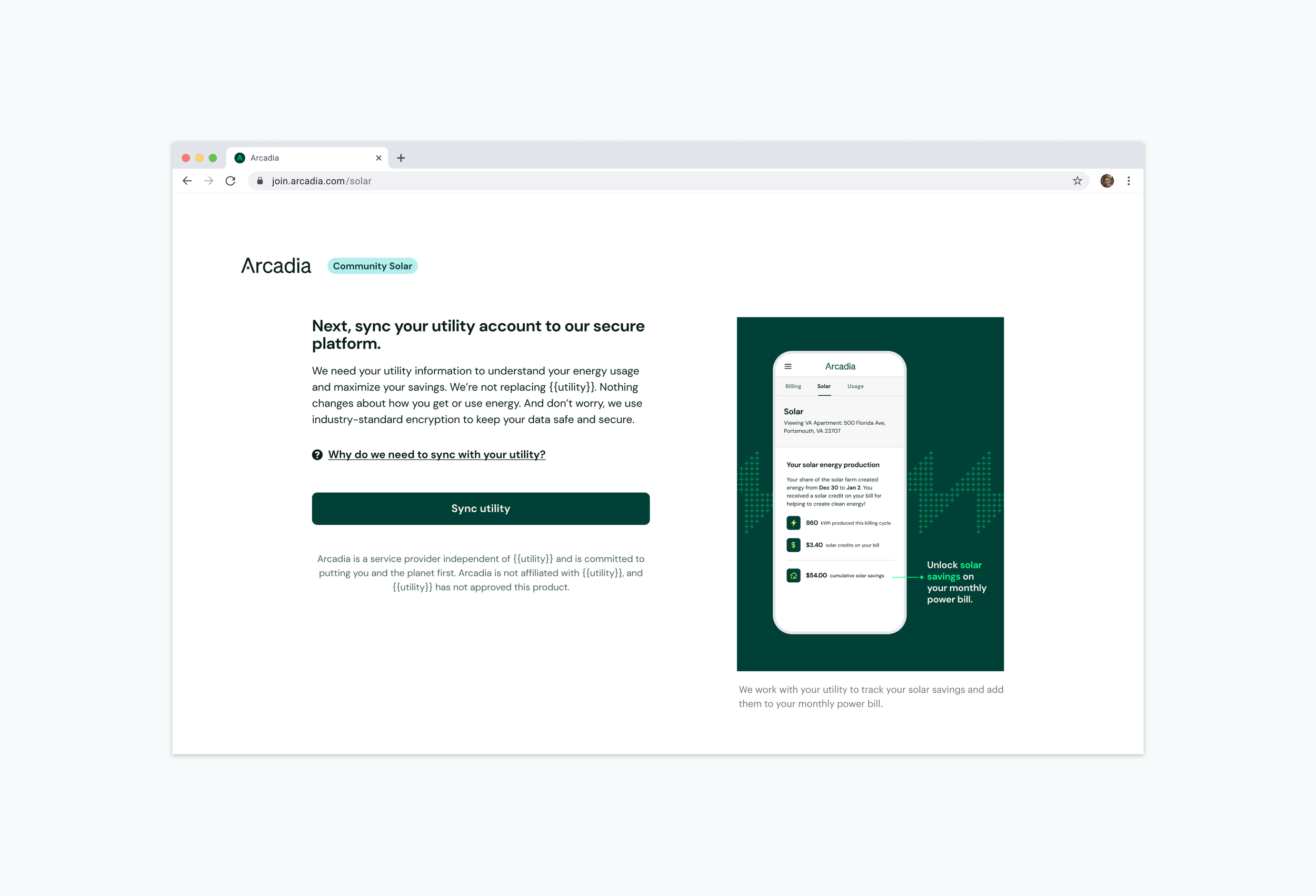
I collaborated closely with the Copy Writing team to achieve the final designs. Below are designs before and after copy collaboration. After we collaborated on the content that was most influential for the screen, I made updates from a ux perspective. For example, I decided to add a lot of supplemental information behind a modal, keeping the CTA clear and benefits highlighted.

Working closely with Copy, I highlighted the benefits of community solar and why a user should sign up. I added a link button to draw attention to a “learn more” modal if users were still hesitant. I also added clarity by adding the user’s zip code to header text. This way a user was absolutely sure community solar was available to them.
UX + Graphic Design
Before this update, a lot of the imagery were solar farms (as seen in “Before” below). From our research, many users found this imagery fraudulent and irrelevant. Alongside the graphic design team, we updated the imagery to focus on product shots on contextual screens. We made sure to highlight the benefits and what a user might see if they joined our program.

Final Designs
Metrics for Success
UserTesting.com
I uploaded a script to usertesting.com to see how if users better understood community solar and its benefits.
User Sentiment

Quantitative Research
Collaborating with the data team we discussed adding the follow elements to track improvements:
A/B test between existing funnel and phase 1 improvements
Tracking drop off on each screen
Click events on learn more modals
Next Steps
Phase 2 Explorations
Here is a hackathon idea my squad came up with as a possible phase 2 iteration. We attempted a one page funnel! We plan to test this with users and understand its implications better before making phase two updates to the sign up flow! Check back soon!